


 by Jared Goralnick


A pet peeve of mine is receiving unprofessional email–but I realize there’s no easy way to learn the subtleties. I’m not talking about email content, but how you format and configure it. This stuff is visible to your recipients and easy to fix. If you’re not familiar with this, then that’s the point–I hope you’ll read on to improve how your email reflects upon you.
Next week I’ll tackle the much harder topic of the email content, but for now…
The From: Be Yourself
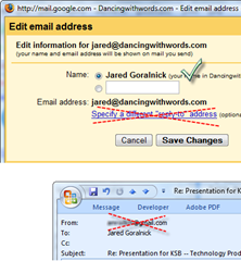 Put your full name in your return address. If you don’t, it will include just your email address in both your From and your recipient’s To, which is likely not helping you to be more private but is definitely not making you look any better
- Don’t use a “Reply-to” address. Many people accidentally create a reply-to address that’s the same as From. If you don’t know why you would need a reply-to address then just don’t use it! (In Outlook that means leaving the fields blank.) A Reply-to fields removes your name from the To field when people write you back–making them look less professional and messing up the sort by From field in many email applications
- Avoid using “on behalf of” by sending it directly from the actual account. This is a problem in particular with Gmail subscribers who send from other email accounts. Here’s more explanation and how to fix it…
The To, CC, and BCC: Respect for Names & Privacy
- Put the full name of your recipient in the To/CC fields. While this isn’t mandatory, it’ll not only look more professional but, well, everyone loves reading their name
- Restrict the number of names in To and CC. If there’s neither a good reason for the people you’re addressing to know one another nor a good reason to Reply All to the message, use BCC instead of To or BCC. Even if it’s just four people, it’s much more professional and respectful (send the message four separate times or run a mail merge if you want to look even better)
Response Points: Use HTML for Clarity
 As a geek, I could debate the merits of plain text vs HTML mail ad infinitum, but I’ll spare you. But when you’re responding to someone point-by-point then HTML simply offers more flexibility and readability…especially if there’s likely to be another round of back and forth. Assuming that you’re responding in HTML, here are some suggestions:
- Use white space. Press ENTER twice or use before-spacing to separate your point from the one you’re responding to. If possible, use indentation to make it even more distinct
- Use color. As a designer I often go for subtlety, but this is all about clarity. Using color to help indicate who was responding or when in the conversation that response took place can nested conversations much easier to follow
- Use inline responses. All of this stuff skips over the point that you should use inline conversations. If the conversation is important enough, inline responses are the easiest way to be thorough and obvious
The Signature: Customize & Minimize
I don’t think enough people adjust their email signatures–and yet it’s the one place you can be unabashedly self-advertising. I use a signature graphic of my name for business people, but with techies or internet types I don’t include it. I’ll also include different URLs depending on the recipient. Here are some ideas for you:
- Use your full signature once in each message thread. So long as your full signature is included somewhere in the discussion, cut out some noise from the thread by thereafter using signatures that are one or two lines (i.e., your name and up to one other thing)
- Let people know when you’re replying on a mobile device. While I recommend removing the brand from your auto-response (do I care that it was a BlackBerry vs an iPhone? no), letting people know you’re on a mobile phone when replying helps them understand if you skipped any points, made typos, or were a little less friendly. I’d prefer that you not reply from your handheld for anything of consequence, but if you must, let people know the context. (It’s a good one: you’re trying to be more responsive so you should be afforded some leeway, right?)
- Change up your signature when appropriate. Have a few canned signatures and/or adjust your signature based on your recipient. Consider highlighting a particular link or fact based on the context
In the next week I’ll post some ideas about creating professional email content. (It will be a very different approach to Chris Brogan’s great article here.)
Got any email tips to share?


You should really subscribe to Technotheory via ![]() email or rss.
email or rss.


")


One other suggestion: skip the funky fonts and colors (especially Comic Sans). Not only can they make an email hard to read, they make the sender look unprofessional.
Amen, Thursday!
Thanks for this Pai. It honestly opened up a deeper world to me in Gmail/email practice as it relates to branding. I wasn’t aware if some of these ideas! Thx.
Yikes Jared – indeed you are not Paisano! My apologies; I just read some of his stuff and my brain hadn’t fully transitioned over. Your blog is fantastic! Thx to Jared ‘Not Pai’ Goralnick.
No worries, Jill–thanks for the comment, just glad to help!!
Regarding using my phone to reply, I use a fun, nondescript line in my signature…
“sent from a phone with little buttons”
it seems to bring context to missed letters, punctuation and a shorter-then-normal reply.
I like that mobile signature–thanks, Kyle
- Avoid unnecessary graphics (to keep size down)
- Keep text as text not as a graphic (better to search)
- When replying remove attachments (The Lotus Notes 8.0. client defaults to reply without attachments)
- Link to larger files on a server instead of attaching (There are many good products to do this e.g. Quickr (integrates with Outlook), Plone, WordPress even)
Daniel, I can’t believe I forgot to mention the larger file size point–I’m going to add that soon to the blog post…it really is SOOOO important.
Thanks!
If your company requires one of those pre-21st century legal disclaimers at the bottom of each email you send, significantly reduce the point size of said text and change the text to gray.
nice post
nethanel.abuthan@intelsat.com