June 30, 2008  by Jared Goralnick
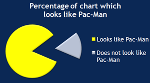
 I’m getting mighty sick of events restricting the use of presentations just because some people suck with PowerPoint. Visuals add a great deal to speeches, and it’s not that difficult to use them more effectively.
Continue reading…
Filed under: Business, Design, Technology
June 23, 2008  by Jared Goralnick
 For the last week I’ve been testing a new theme design on this website. I hope it will make information easier for you to find, and promote a consistent look with my company’s other websites. You’ll be surprised to learn how we did it.
Continue reading…
Filed under: Design, SET Consulting, Word
January 17, 2008  by Jared Goralnick
I can’t stop reading about the MacBook Air, but that’s because I’m a geek who loves sexy technology. Deep down I know that, like the iPhone, it doesn’t really make me more productive. While I do connote portability with productivity (in that portability enables mobility), a few ounces one way or another doesn’t play a role in my travel decisions. We’re in a world where there’s fashionable technology and dull-looking technology…but we’re missing the point. Or at least my point: technology should help us to get work done first and foremost.
Regularly I’ll toss my Dell M1210 into a Waterfield sleeve case with an extra battery and a book. That’ll get me 8 hours for 6 lbs (or 4lbs before the other stuff) with more power than the MacBook Air. Tack on my Motorola Q with an extra battery and I have unlimited free internet if I can’t find a hotspot. What more would I need? (oh, I’ll bring my 1st generation iPod Nano along, too.)
But that’s not really doing my comparison justice. With the MacBook Air I can’t bring along DVDs for a planeride (plus I have two headphones jacks on my Dell). The very thin keyboard, like the iPhone’s missing keyboard, is an adjustment that I wouldn’t look forward to. And the pricetag isn’t exactly forgiving. Continue reading…
Filed under: Business, Design, Productivity, Technology, Tools I Use
January 15, 2008  by Jared Goralnick
After many months of effort, I’m happy to say that my company, SET Consulting, has released a completely redesigned website with mostly new content: www.setconsulting.com. Some new stuff: our team, examples of our work, and filtering our tips based on a particular product (like Word, for instance).
While we regularly work with talented web designers and developers, this was a completely home-brewed effort. No, we’re not planning to offer web design or development as a service to our clients…but we have realized two things:
- (When you have the talent,) a “do-it-yourself” effort for something so important to the company feels incredibly rewarding
- Occasional challenges with coding are worth overcoming when both our work on AwayFind and Office projects often have web components
Deep thank yous go especially to Keith (the design), David (the code), and Kate (the tireless proofreading — here’s her blog) for bringing this to fruition. And, of course, thank you to the wonderful clients who allowed us to create case studies for our portfolio: Continue reading…
Filed under: Business, Design, SET Consulting
August 26, 2007  by Jared Goralnick
Rarely are design problems just about design–and it’s a challenge getting clients to understand that. At the 2007 User Experience Week after party, Doug LeMoine and I had a long discussion about how clients don’t see the functional/engineering/technical components involved in making something “attractive.” While my company is solving design problems on a much smaller scale than his (Doug’s the Director of Design Communication at Cooper), it’s clear to me that this is a systemic misunderstanding throughout the business community.
For just over a year I’ve been lucky enough to have an incredible graphic designer working with me, and that’s led our company to be solicited as much for design as for development and training. Quite frequently we’re asked to “give a facelift” to some Excel report, PowerPoint template, or Word proposal. But while aesthetics may be what they’d like at the end of the day, there are a number of steps to getting there. Giving the client what they want in a design requires helping them to understand what they really need.
Let’s take an Excel project we’ve recently completed. The client sought to illustrate to their prospects the advantages and disadvantages of various employee benefits packages. Their existing report creation process was as follows:
- Take data from a number of places and paste it into various cells and formulas throughout an existing Excel workbook
- Edit a few formulas to address some of the variations in this new set of data
- Edit the source range of the Excel charts and graphs to the newly pasted data so as to fit it within an appropriate range
- Reposition the graphs as Excel often moved them around in the process of updating
- Print or email the reports to clients
The existing process required deep knowledge of what the input data meant, of how Excel formulas worked, of how the final design should look, and of how a mistake in the reports might appear (manual processes like these rarely work on the first try). In short, it required a lot of expertise and a few hours worth of time.
Could we improve the attractiveness of their reports? Sure. Would that design hold up as their data shifted? Not so fast… Continue reading…
Filed under: Business, Design
 by Jared Goralnick
 I’m getting mighty sick of events restricting the use of presentations just because some people suck with PowerPoint. Visuals add a great deal to speeches, and it’s not that difficult to use them more effectively.


 For the last week I’ve been testing a new theme design on this website. I hope it will make information easier for you to find, and promote a consistent look with my company’s other websites. You’ll be surprised to learn how we did it.


